Chicago Neocon 2012 What’s New


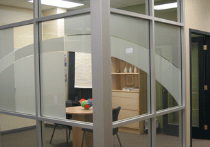
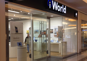
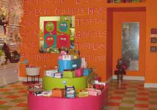
 WOW…So inspired! Impossible to put all of the ideas and cool images I have in my mind down in this format. Visually Chicago was fabulous, from the Architecture…the Art…new products…fresh colour…design details. It was a lot to take in but we did! Some of the trends we saw a lot of were white white and more white. This white was used to balance some very intense and saturated colours. Vibrant oranges, limes, pinks, reds, etc were very high impact becasue of the contrast they made with the overall simplified colour palettes. With white and greys there was a real play with textures, and some textures to an extreme. Some of the words that come to mind are: unexpected, adapted, simplicity, and being true to the materials. Recycling and the “green” movement continues to be at the forefront of everything innovative in Interior and Industrial Design. It was much more about being creative with recycling and it isn’t so much as “recycling to look new”, as it is “recycling and embracing the look of recycling”. Being reused, or being creative with what products can be adapted and utilized in very unique situations. Interiors are moving towards having splashes of fun, not taking themselves too seriously and being bold! Be inspired in your own space!